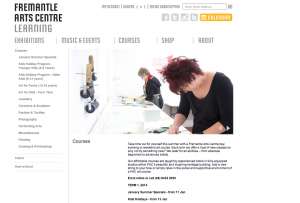
 You probably invest time and effort in making sure your building looks welcoming and inviting and your staff are friendly and professional.
 But can you say the same about your website? Here’s our tips for making your website pull its weight when it comes to making a positive and lasting impression.
1. Keep it up to date
A website that has outdated information and that looks neglected won’t inspire confidence in your web visitors and is likely to leave them feeling frustrated rather than
impressed. Aim to feature the latest information – whether it’s on new
classes, staff changes, special offers or useful links.
2. Don’t navel gaze
People expect to find information quickly and easily on the web. Make
sure the information you publish on your site is visitor-centric and
save your mission statement for your annual report and board
meeting.
3. Watch your Ps and Qs
Take the same care online as you do in print. Spelling errors, grammatical
mistakes, inaccurate, incomplete and outdated information can undermine
your credibility. So allow time for someone to proofread before uploading.
4. Make updating your website easy
Ensure that updating the website regularly is part of someone’s job
description and that staff responsible are confident in using your
website’s content management system.
5. Make sure your website is easy to find
Don’t expect people to remember your web address. Check Google to
see where your organisation shows up in search results when you
type in, for example, your suburb and classes. Make sure your local
council, health centre, library and other key community groups have
links from their sites to yours.
6. Keep your target audiences in mind
Think about the kinds of people and different questions people
visiting your site are likely to be asking. Organise information and
write with their interests in mind.
7. Talk to your readers simply and directly
Staff who answer phone calls or deal with people face to face are
expected to be good communicators. They answer people’s queries
simply and directly. Apply the same standards to your website. Words
and phrases like ‘core values’, ‘stakeholders’, ‘delivery of quality
programs’ are industry-speak that can alienate your site visitors.
Write the way you speak.
8. Design that’s easy on the eye
Text that’s too small, crowded and difficult to read is off-putting.
Ensure text sizes are easy on the eyes, that there’s plenty of white
space and that there’s enough colour contrast between text and
background. Make sure your site is accessible for people with
disabilities and for people who may have images and graphics
disabled on their computers.
9. A picture is worth a lot
Review the photos you’ve used on your website. A photo of your
building is fine – particularly on your ‘Contact Us’ page – but too
many photos of empty buildings or rooms without people in them can
make a place seem dejected. Nominate a staff photographer and
refresh your site with new images of events, people and activities.
10. Save time and money
Reviewing and improving your website strategy takes time and effort
but it pays off. If your website is attractive, enticing and offers
comprehensive information that people can view 24/7, then you are
saving money on photocopying, printing and staff time spent
answering emails and phone calls. Better still, it’s out there on the
World Wide Web, projecting an impressive public image to the world.

